
PhysioAide

Overview
Creating a Minimal Viable Product for a physical therapy app that allows users to view and perform their prescribed at-home exercises from the convenience of their phone.
Role
UX Researcher & UX Designer
Timeline
8 Weeks
Background
Physical therapy is a big component of a lot of people’s lives whether they are battling injuries, recovering from surgery or are expecting to have surgery in the near future. Physical therapists do a great job of treating their patients and providing them with the necessary information needed to have a positive recovery process.
The Challenge
Oftentimes however, patients are unable to complete their prescribed at-home exercises that serve as a crucial component of the recovery process. This can be attributed to several factors, but we often see that there is no definitive resource that patients can use to view and complete their exercises.
The Solution
An app where users can view and perform their prescribed exercises while also having access to extra resources can help minimize this issue. Users will be provided with critical information while being able to communicate with their providers when they are not in the clinic themselves.

Flushing Out The Problem
User Interviews
Interviews were conducted between both service providers and patients alike. 3 physical therapists and 2 patients were interviewed to determine any relevant issues they deal with as well as what elements and features would be considered most useful.
The Service Providers
Physical therapists were asked to describe the issues that arise when patients don’t complete their at-home exercises, and how this affects their treatment plan. The therapists were also asked how the exercises are prescribed (physical copy or digital). Lastly, the service providers were asked about the display of patient information and how HIPAA violations can be avoided when using the app.
The Patients
Patient interviews focused more on the resources they were provided. My questions also focused on how these resources were provided (physical copy or digital) and if these resources were useful. Questions were asked to determine where the resources succeeded, where they failed and what potential features would improve upon their experience.
User Persona
Using the data we previously collected, a user persona was created in order to help us pinpoint the audience we are designing for. Along with the data, I also took into account my personal experience as a physical therapy aide. I took into account attributes and characteristics that tend to be prevalent among patients I have worked with over the past 3+ years.
Competitive Analysis
Researching similar products was difficult since most required an access code. However, I was still able to conduct research on 3 different products that aim to accomplish a similar goal. Although frustrating, this proved to be valuable as the use of an access code ensures that only the patient can gain access to the personalized routine.
Information Architecture
Feature Map
Once the user interviews and competitive analysis were completed, a feature map was put together. The features were organized based off importance to the patients and providers as well as the findings from the competitive analysis.

Accounting For the Timeline
The timeline for this project was 8 weeks, so some of the features had to be pushed back in order to complete the project on time. This is why some of the more popular features, like video tutorials or video chat, had to be sorted into the “Can Come Later” category.
Sitemap
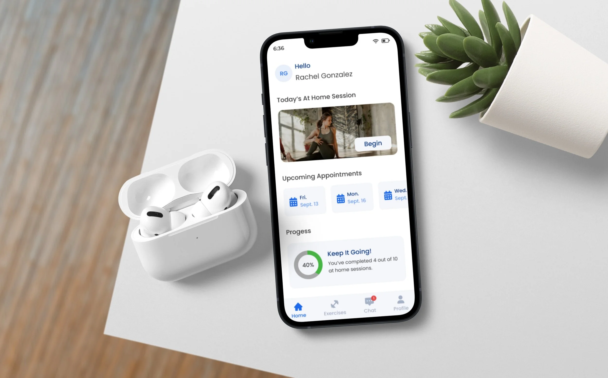
The main thing I wanted to focus on when it came to this design was that I wanted to ensure that each task was simple and straightforward. Patients would have a tough time completing their exercises if the design was complex, thus ensuring that they wouldn’t follow through with their routines. Simplicity was key.
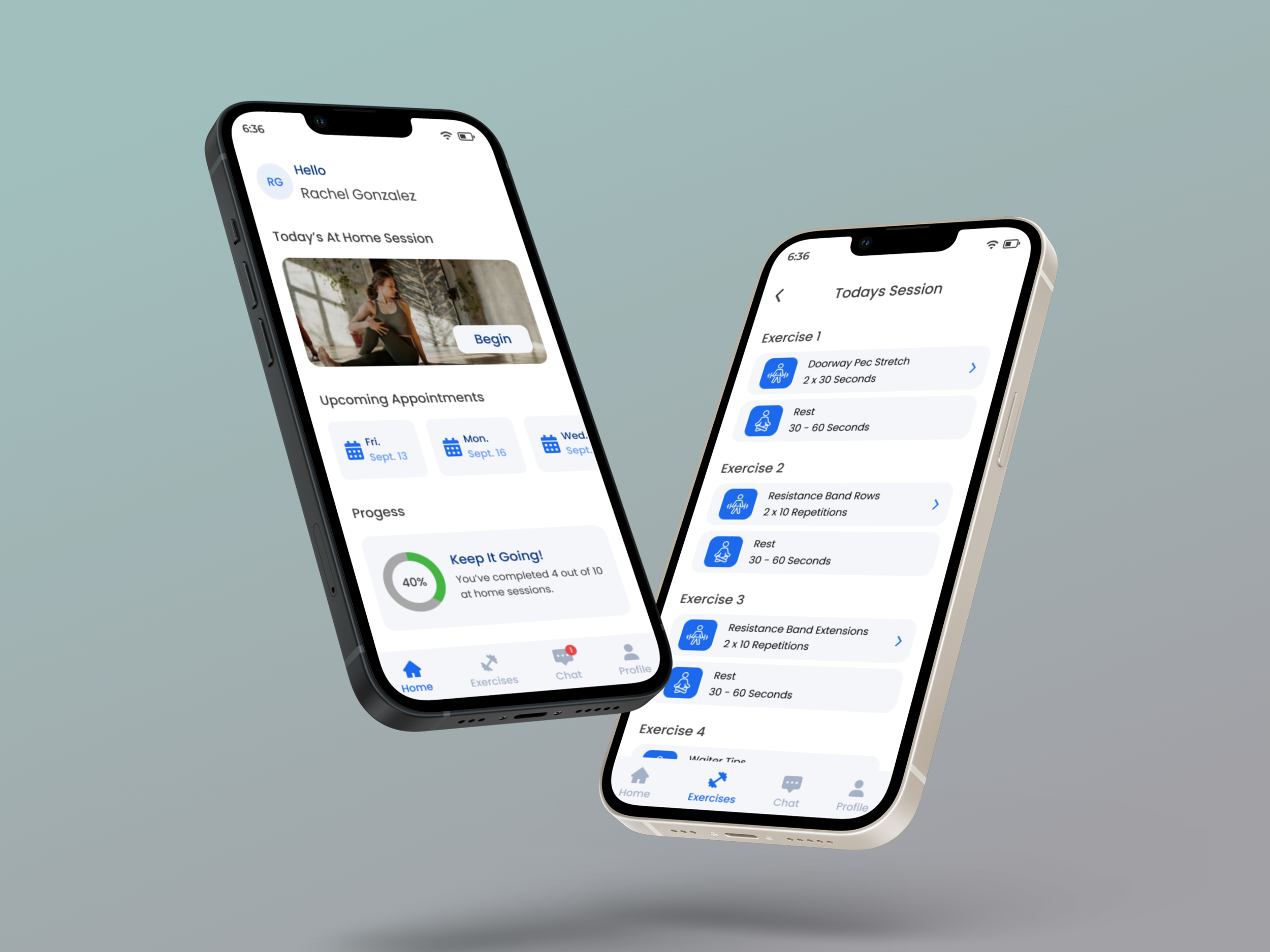
Taskflow #1: Completing the at-home session.
Taskflow #2: Searching for a routine using the body part filter.

Wireframes
As previously mentioned, the main key behind the design was to keep it as simple as possible. I focused on implementing this idea into the wireframes for each screen I designed. I excluded a hamburger menu because I wanted the users to know what tasks could be completed simply by looking at the content on the page and the navigation bar below. I also wanted the design to look familiar to the users, which was a driving factor behind the choice of icons and the dropdown menus.

Creating The Brand
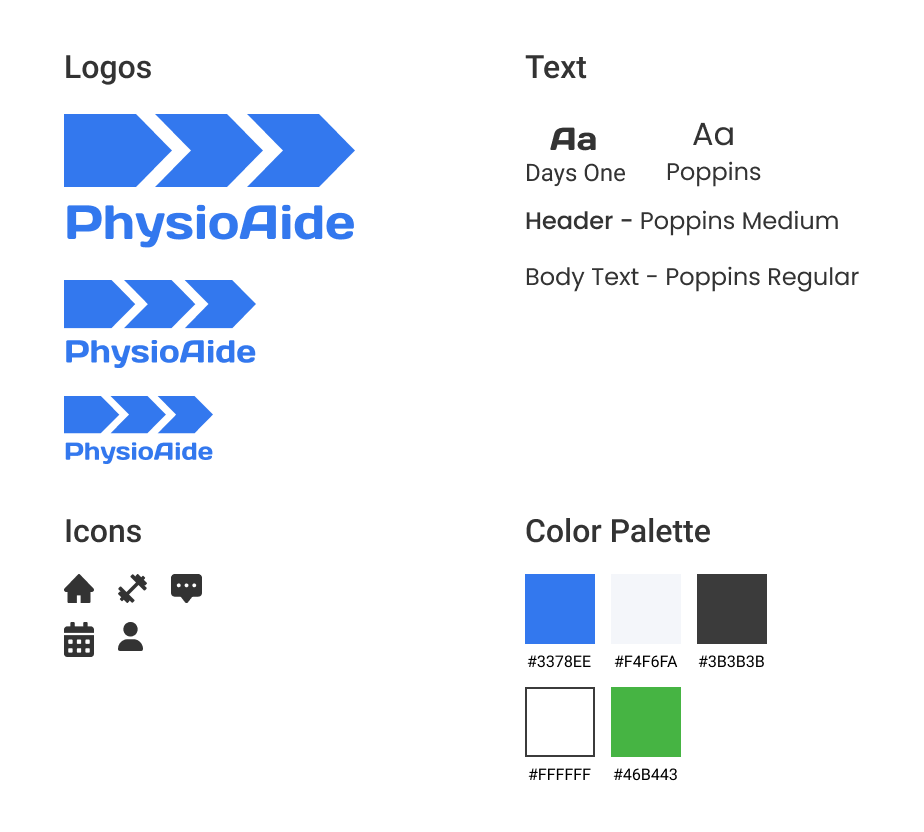
Logo
The main idea behind the logo was the concept of movement. There is a quote within the physical therapy community that says “motion is lotion”. This means that exercise and movement are the basic activities that keep the body strong and healthy. Using arrows as a symbol, I merged this concept with the idea of a patient progressing forward with their recovery by using the app.
Text and Icons
For the icons, I chose those that would look familiar to the users. For the text, I went with a simple font that was both legible and had a modern look.
Color Palette
Blue is known to have a cool and calming effect when used in a design. Because of this, I used different shades of blue to help users stay relaxed while completing tasks that can be stressful. For other elements, I chose more neutral colors that would help accentuate the blue.
Hi Fidelity Design
Usability Testing
Overview
Once the hi fidelity prototype was completed, I moved on to the next phase which was conducting usability tests. For these tests, I recruited 5 participants and conducted remote interviews. During each session, I instructed the users to perform 4 different tasks and observed how each was performed by having them share their screens. Once each task was completed, I asked follow up questions to determine how and why they decided to perform the task.
Task #1: Successfully log in to the app using the access code and email.
Task #2: Complete the at-home sessions and the post-session questionnaire. For the sake of time, users were instructed to only worry about completing the first and last exercise before moving on to complete the session.
Task #3: Find an exercise routine that is specific to the shoulder.
Task #4: Send a reply message to your service provider.
Affinity Map
Throughout the duration of the tests, I took down several notes and observations and organized them into an affinity map. These notes were organized into different categories and played a strong role in the remaining steps of the design process.

Usability Test Results
Overview
The usability tests were completed with great results. All of the participants were able to complete the tasks with little to no issues. User’s described the design as being “user friendly”, “relaxing”, “simple” and “familiar”. Although the tasks were all completed, some pain points did arise.
Pain Points
The pain points were discovered while users were completing task #4. Other small issues were observed with the other tasks, but the revisions needed were not considered to be an immediate priority.
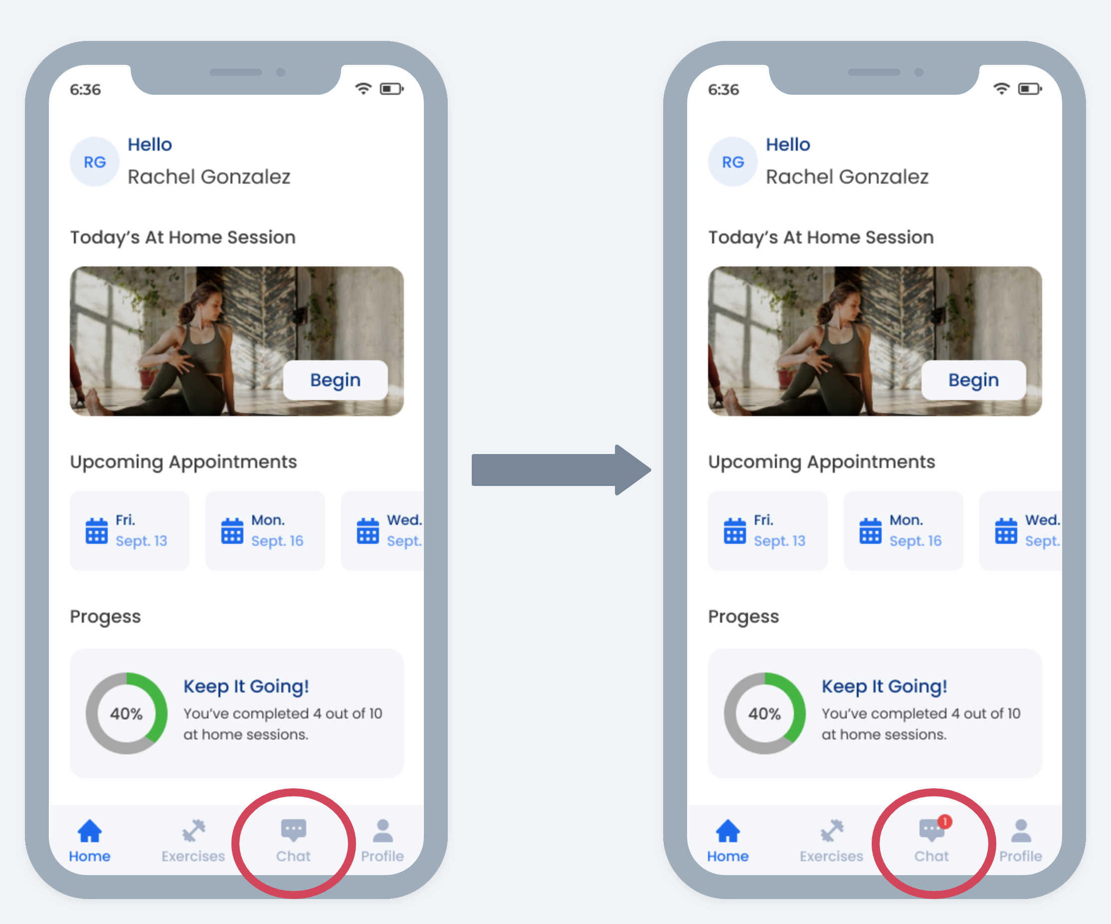
Pain Point #1: 3 out of the 5 users noted that they did not know where to begin the task initially because they didn’t notice any “New Message” notifications.
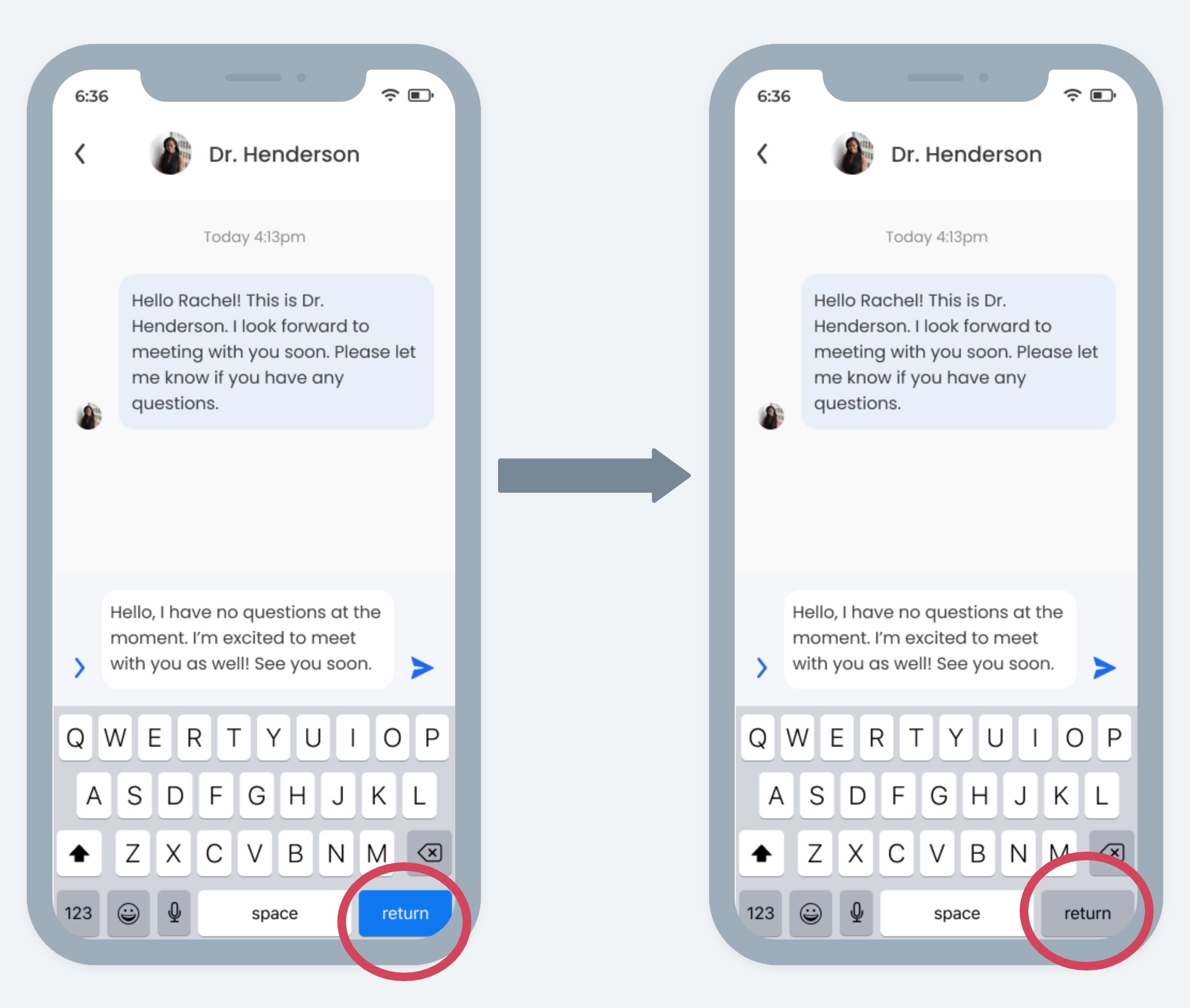
Pain Point #2: While sending the reply message, 3 out of the 5 participants attempted to send the message using the “Return” key instead of the send icon. This was due to the similar blue color between the send icon and the “Return” key.
Priority Revisions
Pain Point #1: I added a red notification to the “Chat” icon on the bottom navigation. I chose to do this because this is a commonly used method that further reinforced the idea of familiarity within the design.
Pain Point #2: I simply changed the color of the “Return” key to match the color of the other keys at the bottom of the keyboard. This should minimize the confusion that users came across when attempting to complete the task.
The Revised Prototype
What’s Next?
Revisions and Testing:
The next steps would be to work on any pain points that weren’t initially categorized as priorities. I would also like to work on adding more routines and integrating them into the prototype. Once all of these tasks were completed, I would run more usability tests and iterate accordingly. If more time was available, I would have liked to work on a search feature as well as the possibility of adding video calls and tutorials.
Challenges:
Time. Some ideas and concepts were unable to be explored due to the timeframe of the project.
Research. Dealing with a project within the healthcare industry can be tough. You have to perform extensive research to ensure the project stays within guidelines and some resources might not even be accessible.
Final Thoughts:
This project challenged me in a lot of ways. It forced me to step out of my comfort zone and interact with users more than I ever have in the past. It taught me the importance of sticking to a timeframe and not trying to do too much right off the bat. I learned just how crucial research is to the design process and that creating a brand is no easy task. Despite the challenges, I was happy with the results and felt like I built a strong product for users that truly need it.
My Other Work
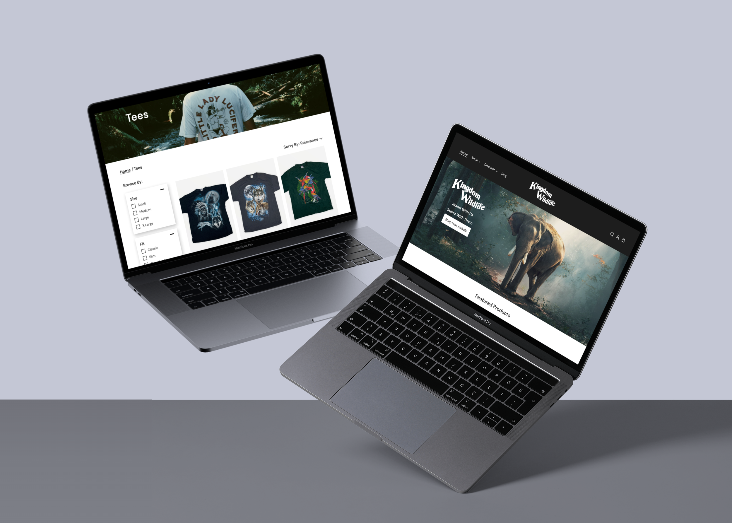
Kingdom Co.
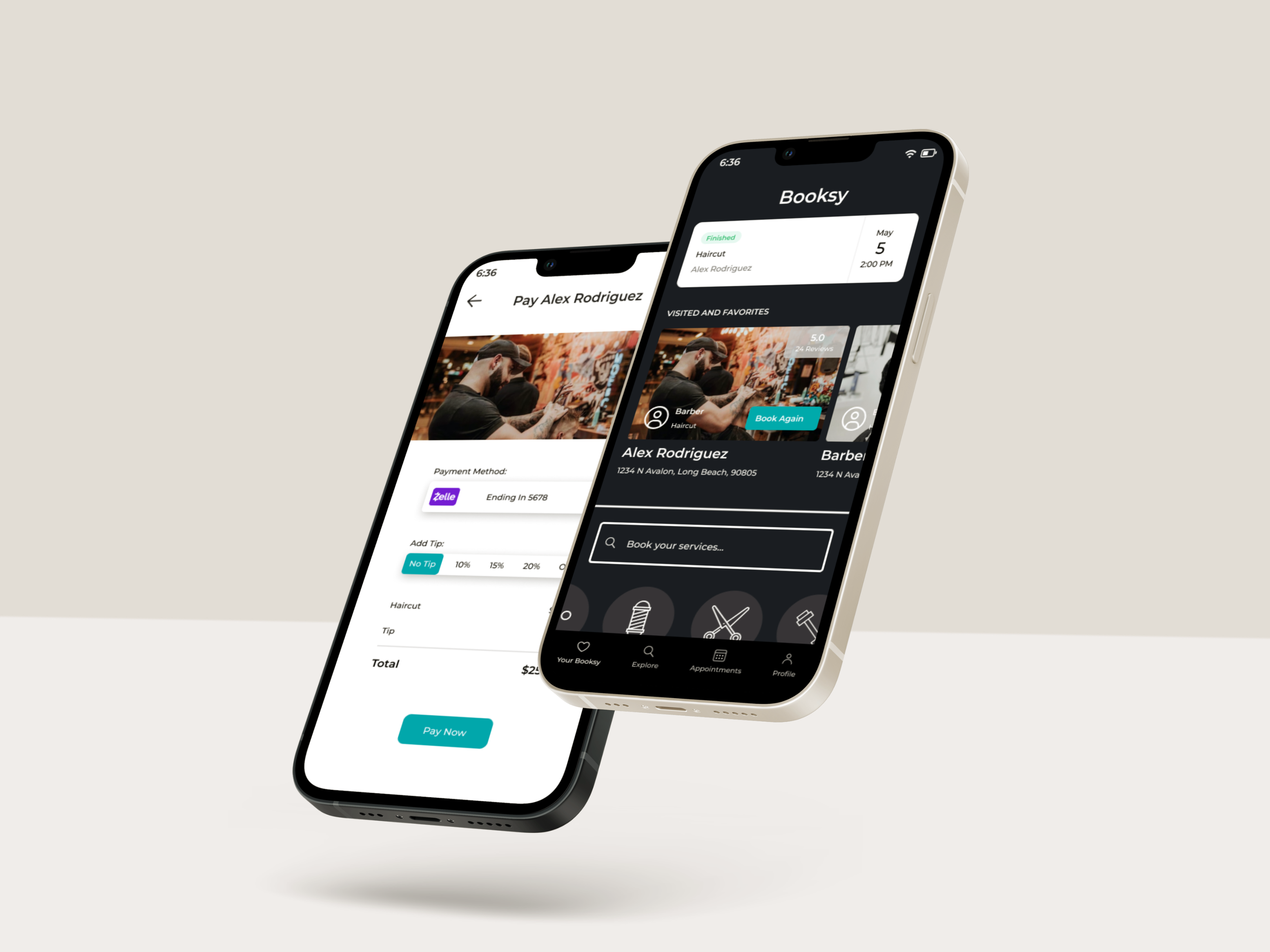
Booksy